Auth Home
Auth Home
The authenticated home is a vital part of the Pearson+ product. It’s more than just a home screen for a stack of titles to live; it’s an evolving resource – career development and growth, wellbeing, workforce skills, study channels, and offers are just the beginning of what this interface will contain.
Project Type
Web, iOS, Android
Collaborators
Product Management, Executive Leadership, Accessibility, Learning Design, Engineering
Workshop
Challenges
The future of authenticated home meant that the interface needs to be truly scalable. Myself and a colleague conducted a design workshop with fellow designers, product managers, engineers, and executive leadership.
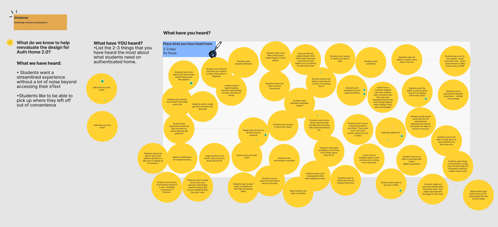
The team put together what they’ve heard the most about what students need and voted on ideas
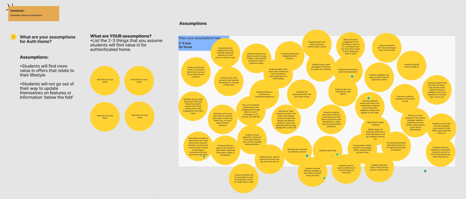
The team put together assumptions they had and voted on ideas
Takeaways
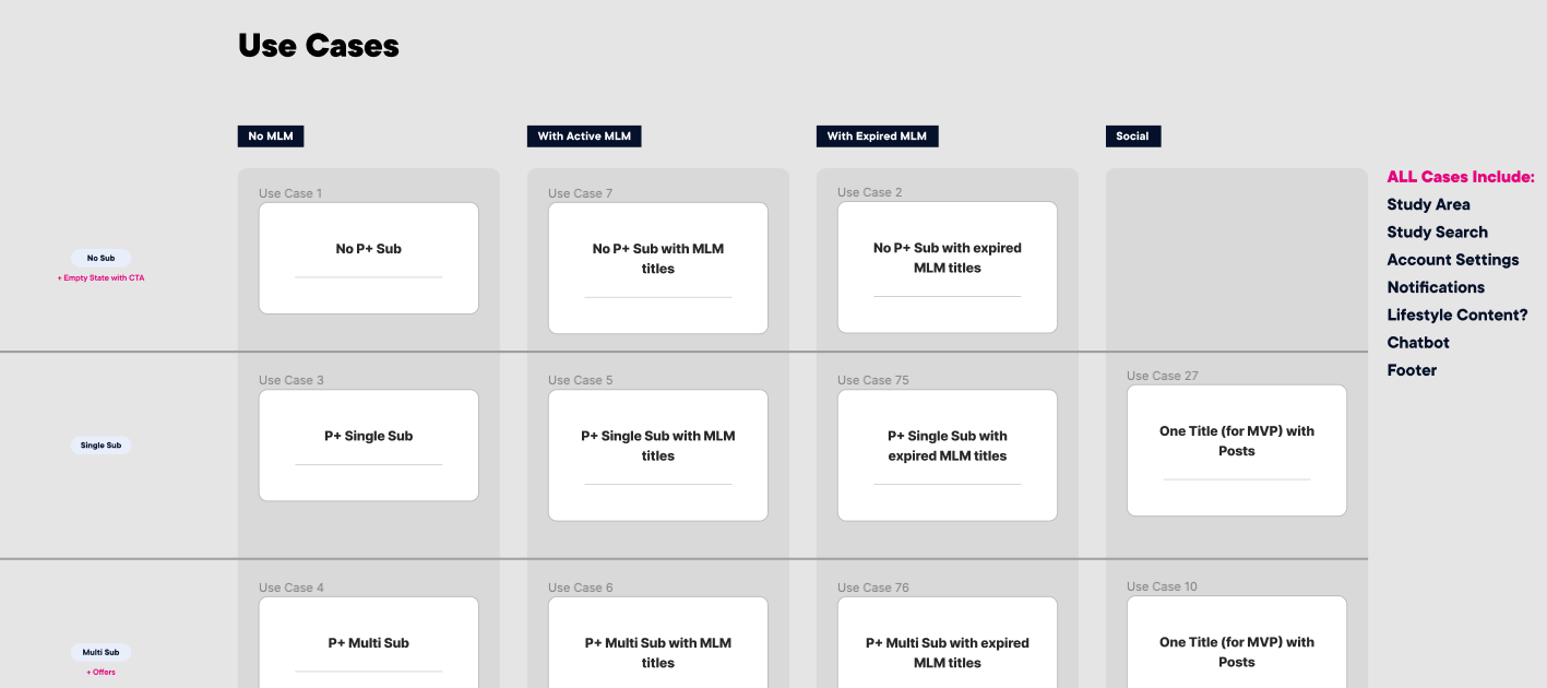
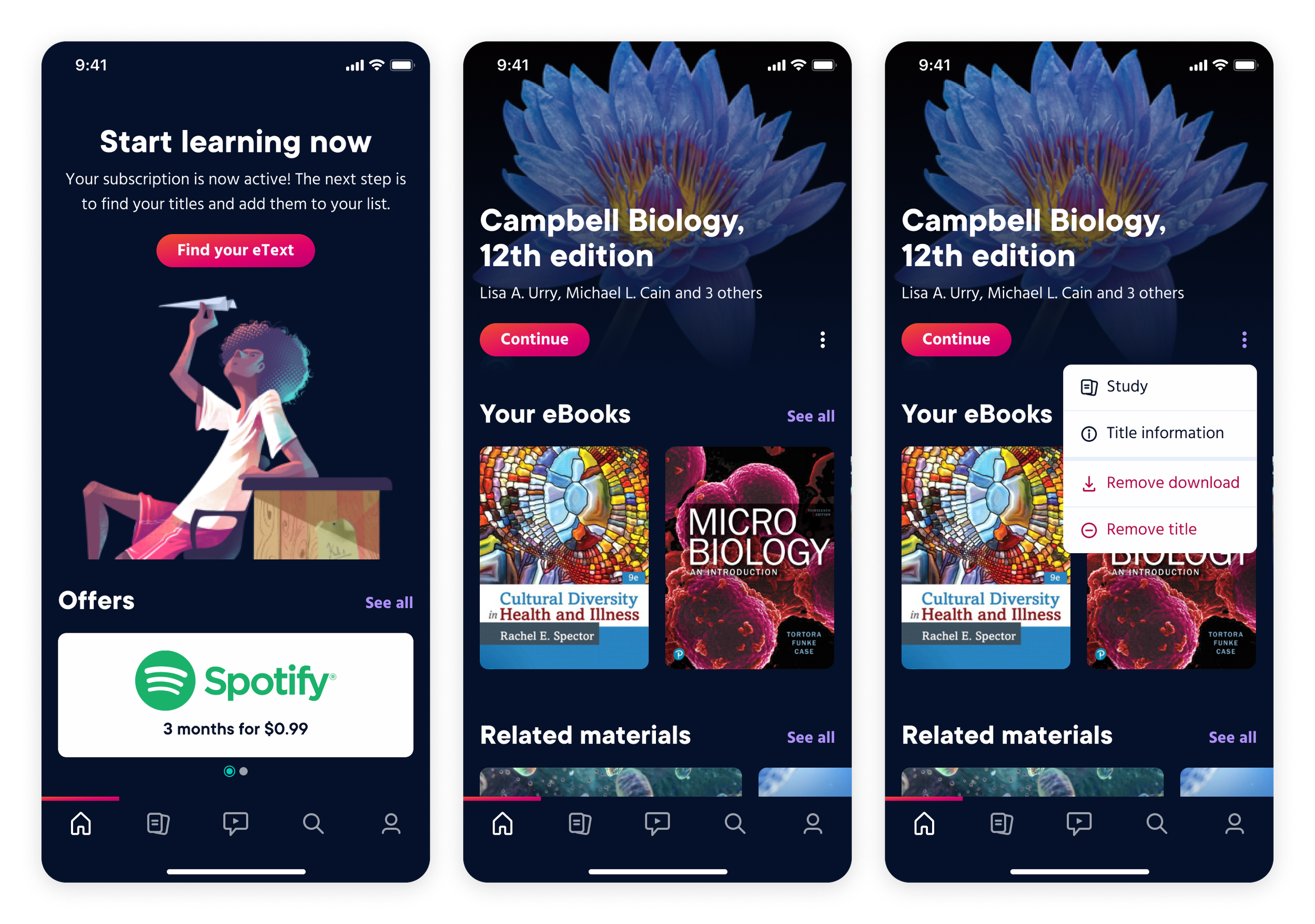
We had a lot to unpack but ultimately created a game plan for this beast of an experience. We gathered all of the possible scenarios including error states, empty states, subscription type, and user type.
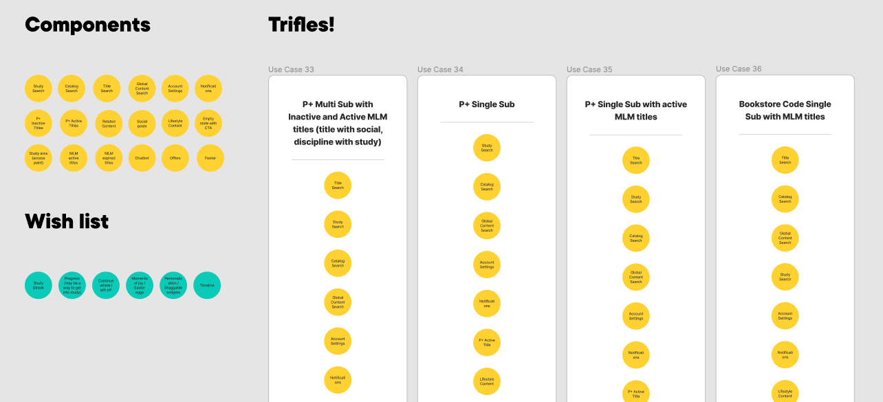
The interface would need to be designed in layers. We called these our use case trifles because who doesn’t love a good dessert?
Each part of the layout would be built in components so that content could be swapped out as needed, depending on the use case and what the user should have access to at that point in the flow
A small portion of the use cases we were organizing together in the workshop
Putting a few use cases together in our trifles as a starting point
Visual Design
Next steps
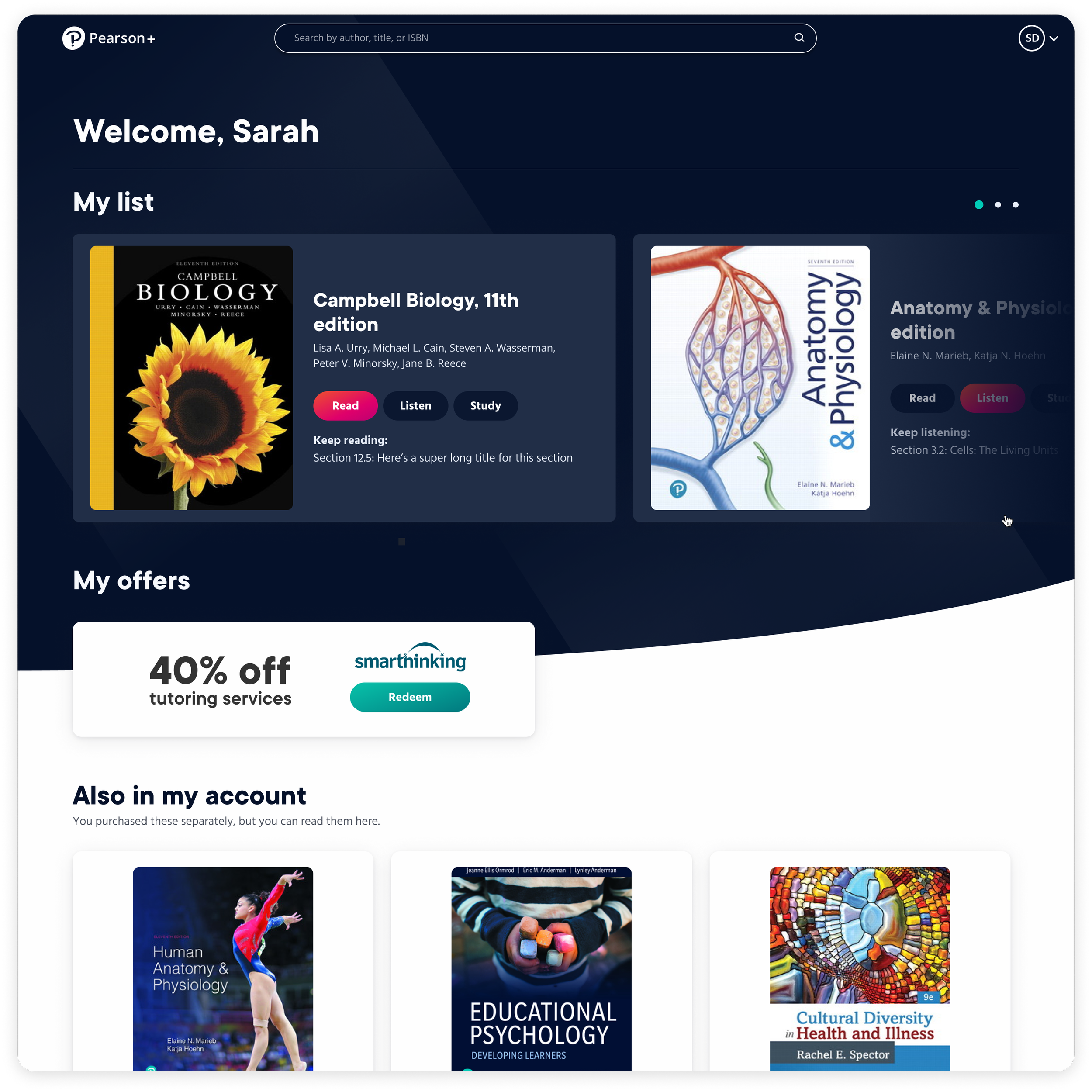
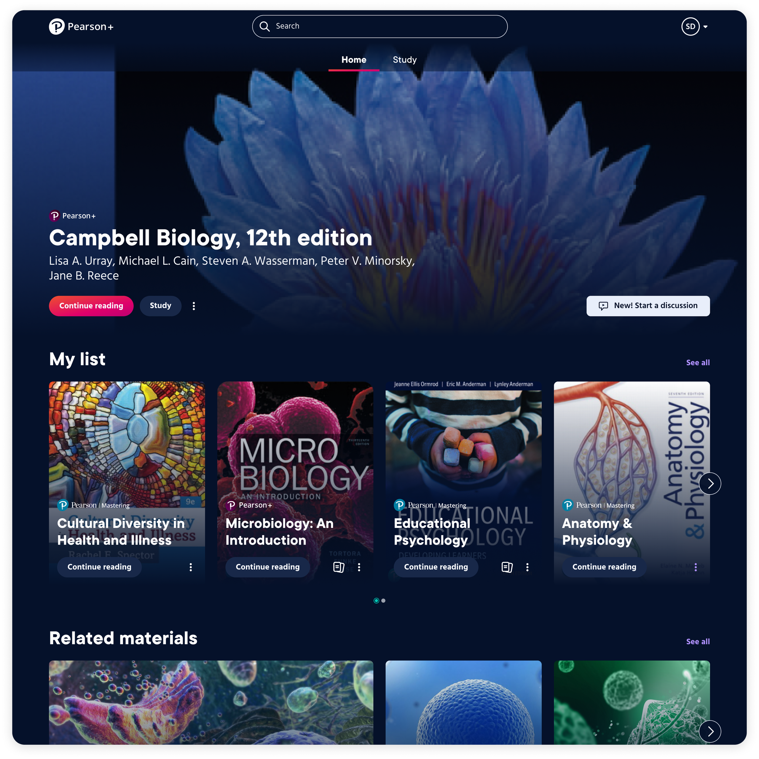
I was the visual designer assigned to the project after we got through some rough wireframes based on our findings in the workshop. The current auth home design needed a few updates because users wanted a way to view more titles at a time; the carousel had become difficult to navigate. We also found that students didn’t understand the difference between their Pearson+ titles and MLM titles or why it mattered.
Before: The carousel is hard to navigate when there are a lot of titles and content is not separated in a useful way
After: Titles are organized by most recently used with a hero image at the top
Outcomes
Initial testing for the updated design was successful. Students compared the interface to streaming services that they’re accustomed to using and responded very well to the layout. For first release, we designed over a dozen use cases to account for all the error, inactive, and empty states for various user types. This project is still in its infancy and evolving daily as new integrations and opportunities come into play.


