Pearson+
Pearson+
Pearson+ is a direct-to-consumer app for higher ed students. I worked as a senior visual designer for various features, including a notebook with highlighting, content audio player, and title home screen. As the project grew, I became a team lead for the design framework to establish foundational styles, components, and patterns to achieve consistency across the product.
Project Type
Web, iOS, Android, Framework
Collaborators
Product Management, Executive Leadership, Accessibility, Other Designers, Learning Design, Engineering
Notebook Feature
Challenges
Historically, students don’t use the note taking feature in the eReader experience. I conducted user testing to better understand their process for taking notes while studying and reading for their class.
Takeaways
After gathering helpful feedback from several participants, the team decided to make a few improvements to ameliorate the notebook experience in our product:
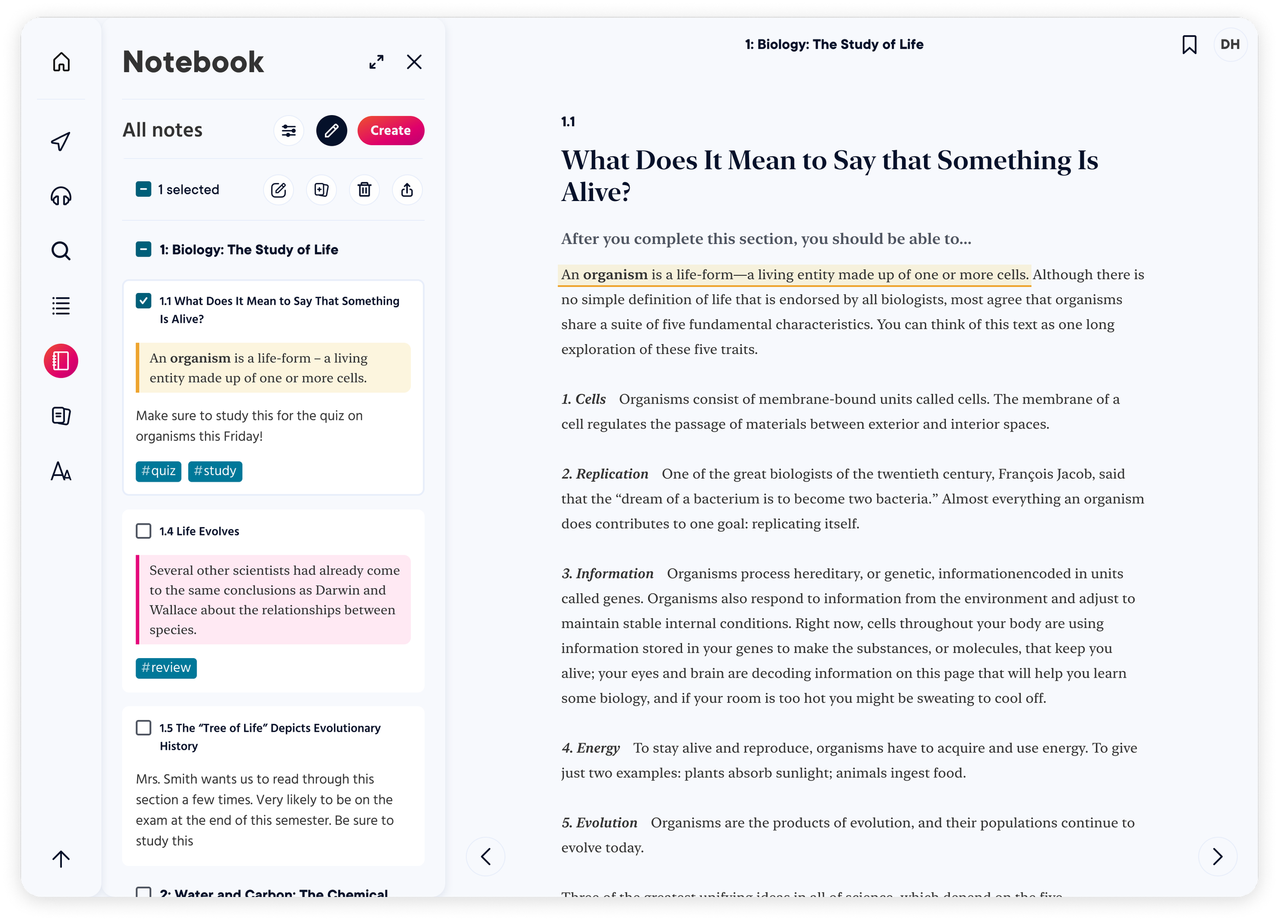
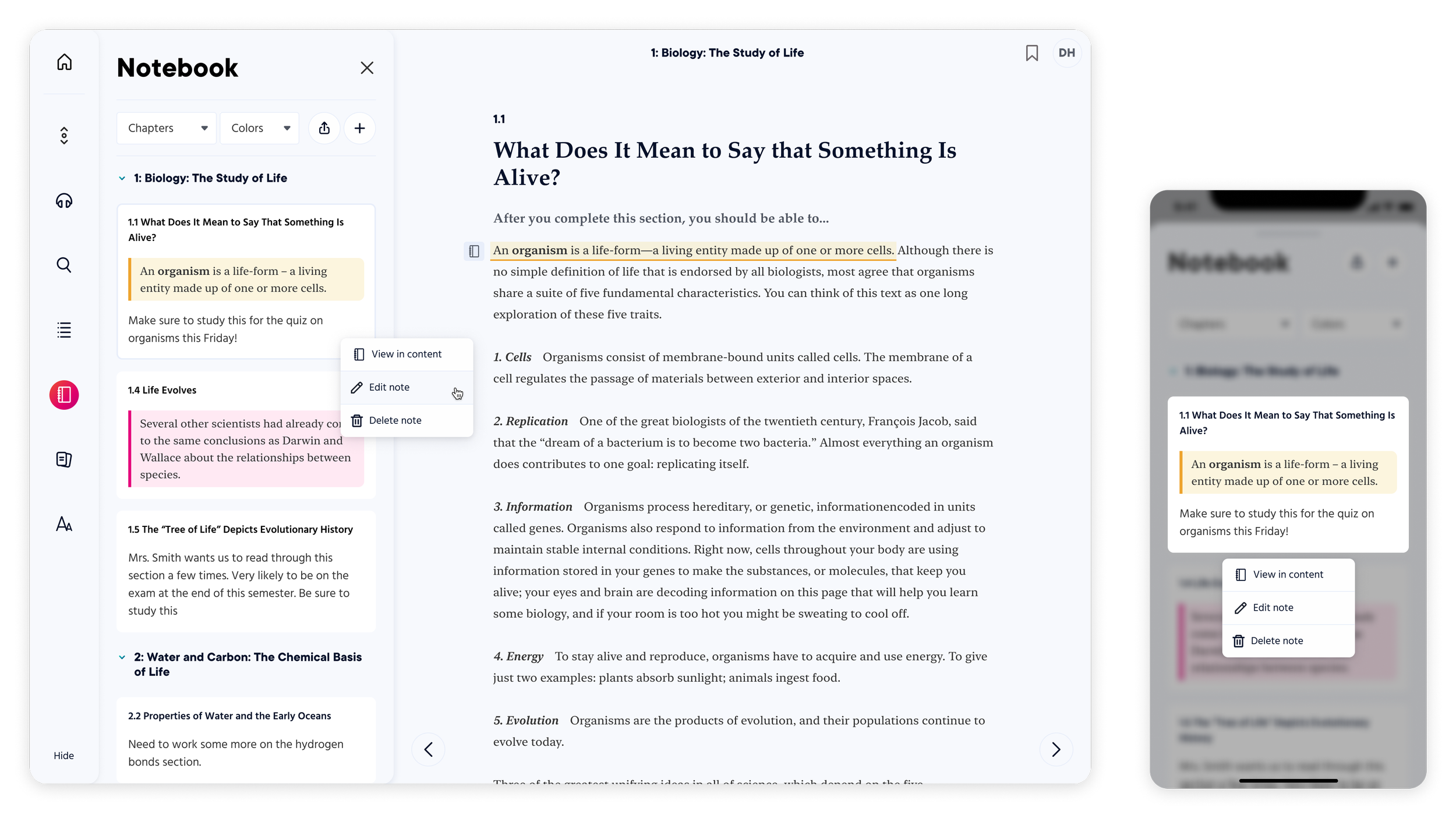
Students don’t need a bulk editing option and would prefer a simplified interface. Removal of bulk editing also implies that we need to consider an obvious way to edit individual notes
We learned that students don’t really put in the effort to create tags when there is a filter and search option
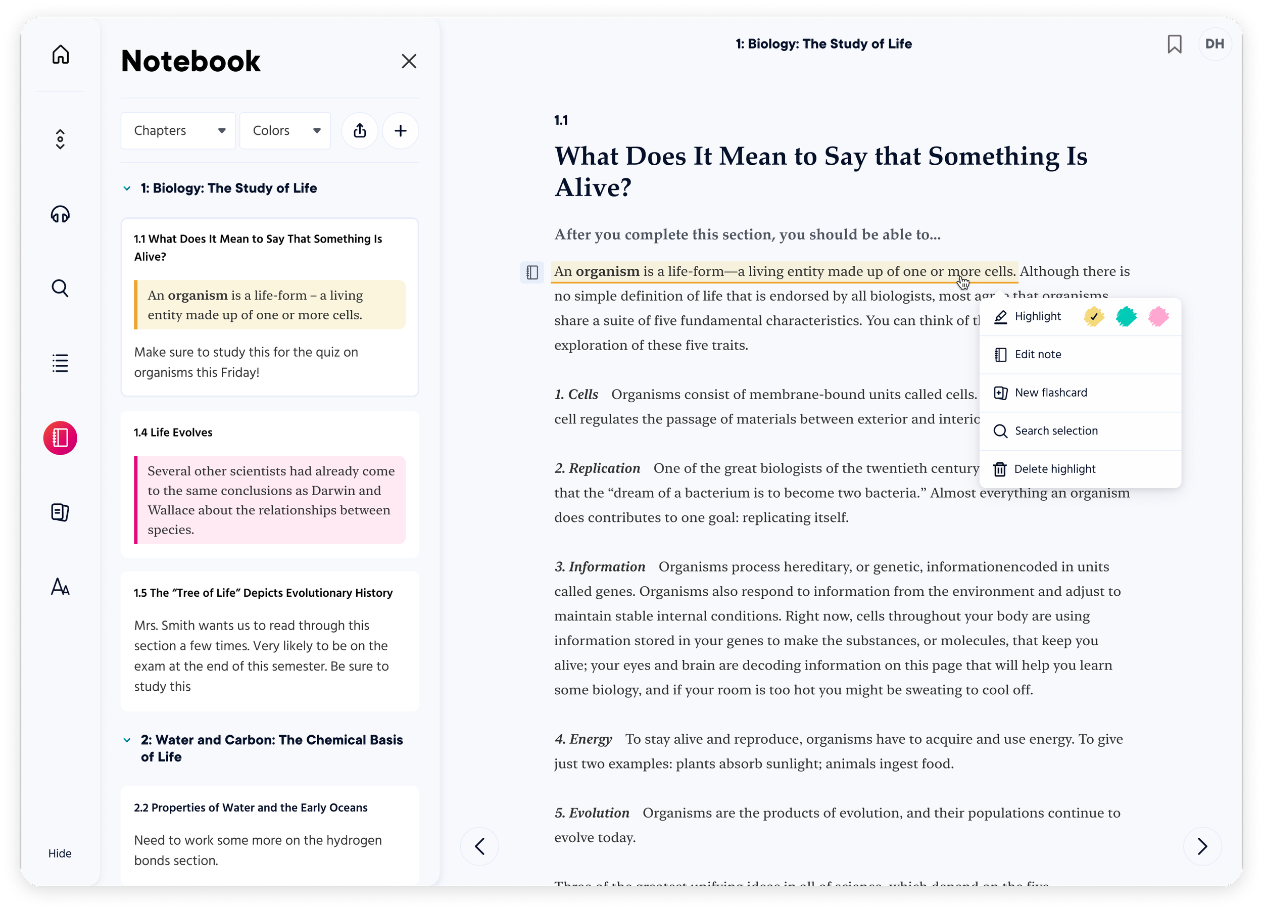
It is not common for participants to organize by highlight color, but if they do, the yellow highlight is considered a default color
Before: Notebook with bulk editing and tags attached to note cards
After: Notebook with filtering options and yellow as the default color for highlights
Notebook in desktop and mobile includes native interactions to edit a single note (right click and long press)
Audiobook Feature
Challenges
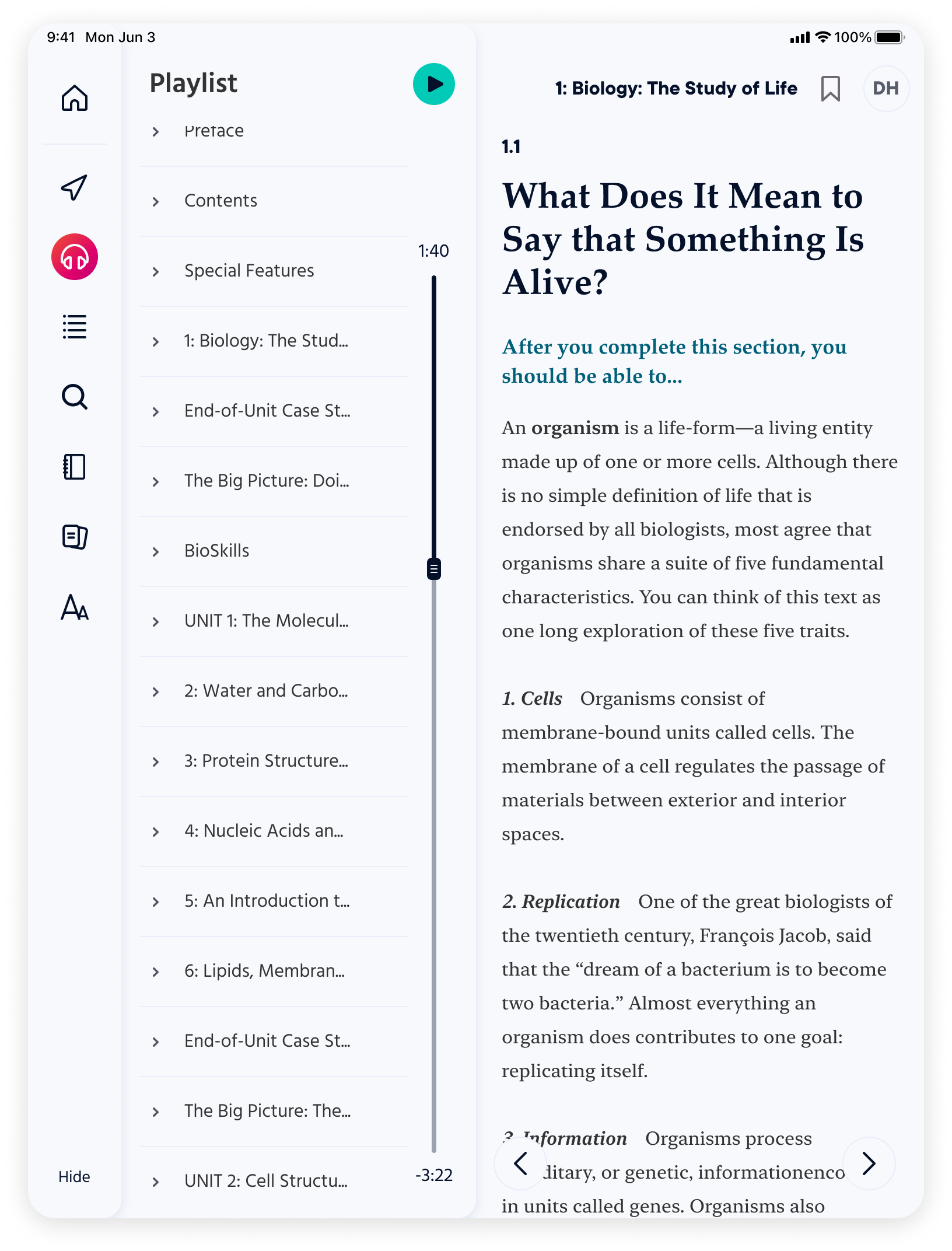
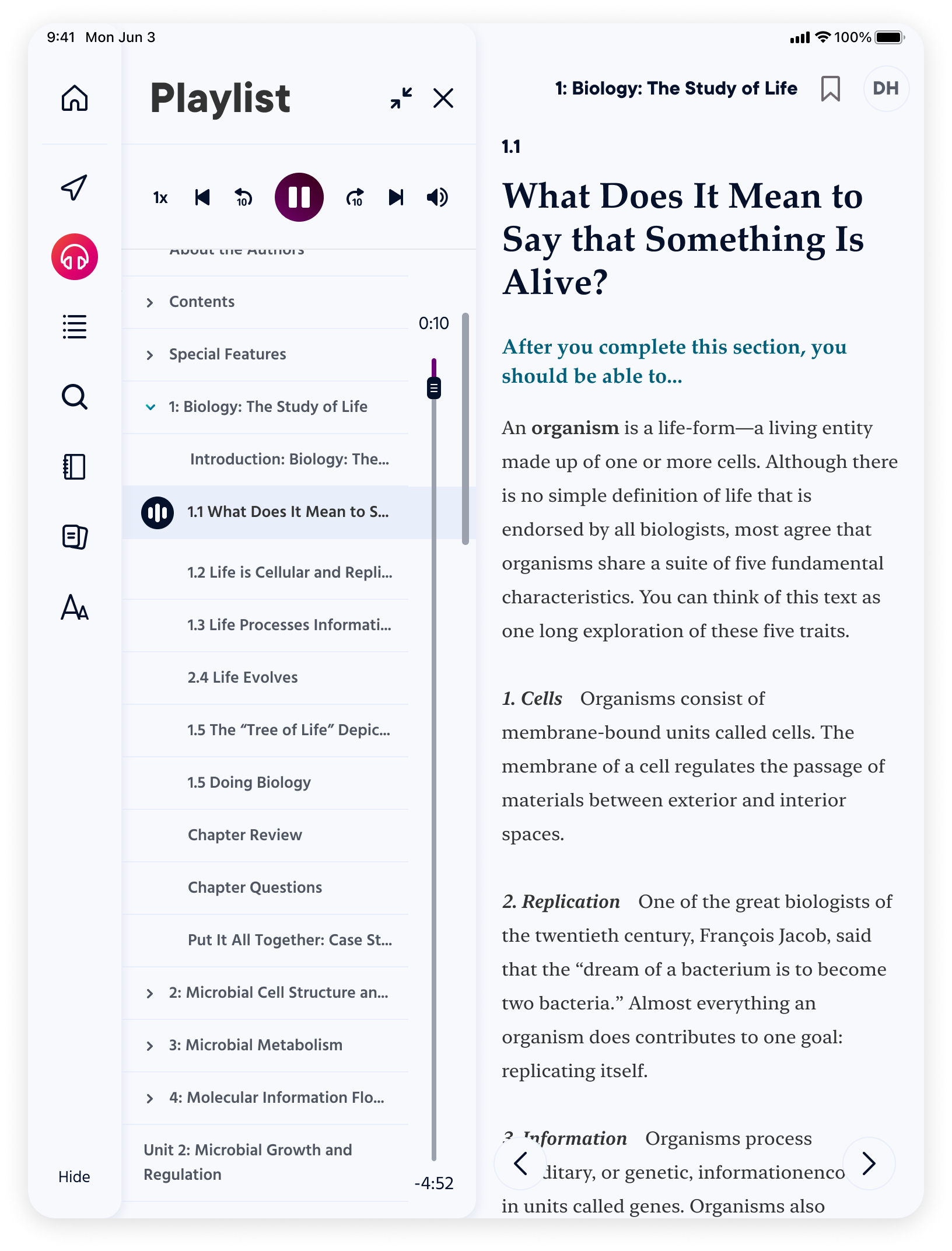
The product was getting a lot of poor App Store reviews about missing a way to set the speed for their audiobook. Interestingly enough, we did have a speed setting available among our audio features but users didn’t notice it.
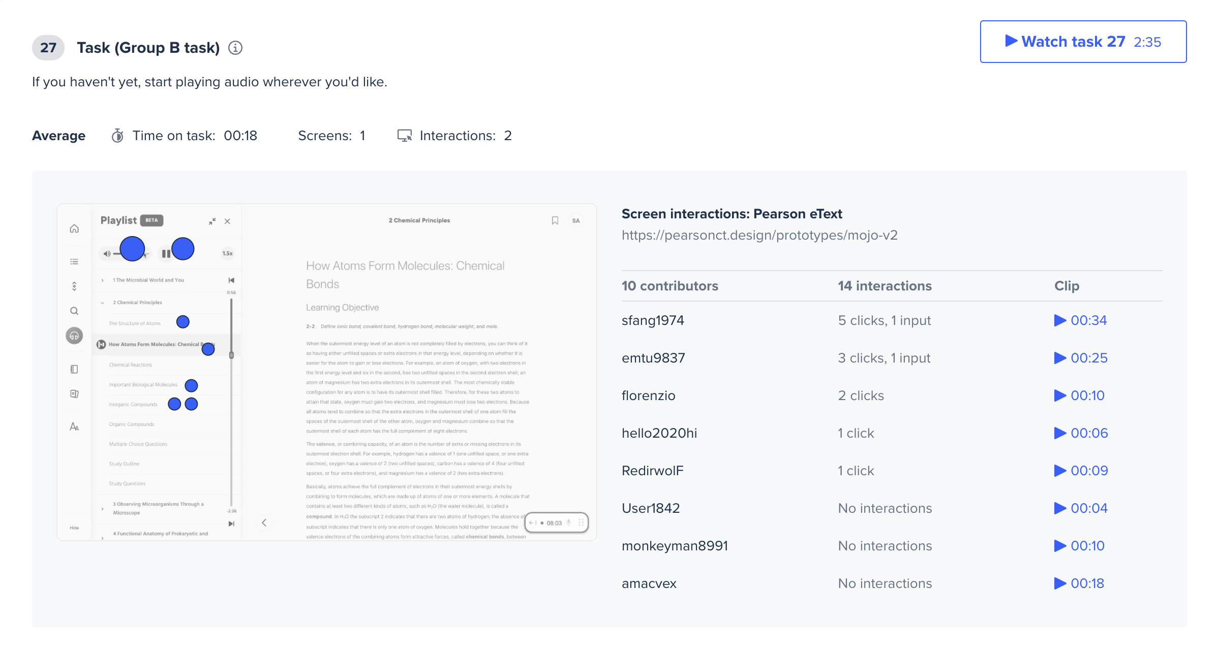
A summary for one of the testing tasks via UserTesting
Takeaways
After setting up an unmoderated A/B test with 10 participants that are enrolled in a higher ed course, we made some adjustments to the audio features layout to ensure that the important information remains accessible:
Students wanted a way to skip chapter tracks instead of scrolling through a long list of section names
Keeping the available features, even upon scroll, apparent at all times is worth the real estate
Before: Notebook in tablet view showing the audio features being hidden upon scroll
After: Notebook in tablet view will keep the features upon scroll so they are always accessible
outcomes
Pearson+ will never be complete and that is totally okay. We are constantly learning from our users, adapting to their needs, and iterating based on research findings. The iOS and Android apps are successful with thousands of daily users. The Apple Store rating is 4.8/5 and the Play Store rating is 4.6/5.

